TIME FOR A NEW HOUSE PRICE VISUALIZATIONS.
In this post I’ll new way to visualize recent house price trends with R.
Data
We’re going to be visualizing the Freddie Mac House Price Index. We talked about these data earlier this month, see this post for some other visualizations.
You can download the Excel spreadsheet with state house price index values here. Note that this code is based on the release with data through March, 2017, future releases may shift the exact location of the cells. Using the range argument of readxl we can reach into the spreadsheet and get our data ready. Let’s try it:
library(zoo,quietly=T,warn.conflicts = F)      # used for rolling window operations
library(readxl,quietly=T,warn.conflicts=F)
library(purrr,quietly=T,warn.conflicts=F)
library(animation,quietly=T,warn.conflicts=F)
library(tweenr,quietly=T,warn.conflicts=F)
library(ggplot2,quietly=T,warn.conflicts=F)
library(tidyr,quietly=T,warn.conflicts=F)
library(dplyr,quietly=T,warn.conflicts=F)
library(lubridate,quietly=T,warn.conflicts=F)
library(data.table,quietly=T,warn.conflicts=F) # for the shift function
library(scales,quietly=T,warn.conflicts=F)    # for labels

###############################################################################
#### Read in HPI data
###############################################################################

df<-read_excel("data/states.xls",
               sheet = "State Indices",  # name of sheet
               range="B6:BB513" )        # range where data lives

###############################################################################
#### Set up dates from January 1975 to March 2017
###############################################################################

df$date<-seq.Date(as.Date("1975-01-01"),as.Date("2017-03-01"),by="1 month")
df.state<-df %>% gather(geo,hpi,-date) %>% mutate(type="state")
Now that our data is loaded we can do some manipulations. In particular, I want to append the national U.S. average index as a new variable in the data.
###############################################################################
#### Transform data
#### Needs library zoo for the rolling window operations
###############################################################################
df.state<-
  df.state %>% group_by(geo) %>%
  mutate(hpa=hpi/shift(hpi,12)-1,
         hpilag12=shift(hpi,12,fill=NA),
         hpimax12=zoo::rollmax(hpi,13,align="right",fill=NA),
         hpimin12=-zoo::rollmax(-hpi,13,align="right",fill=NA)) %>% ungroup()

###############################################################################
#### Transform data
#### Add national variable as us.hpi, us.hpa variables
###############################################################################

df.state<-df.state %>% group_by(date) %>%
  mutate(us.hpa=hpa[geo=="United States not seasonally adjusted"],
         us.hpi=hpi[geo=="United States not seasonally adjusted"]) %>%
  mutate(up=ifelse(hpa>us.hpa,hpa,us.hpa),
         down=ifelse(hpa<=us.hpa,hpa,us.hpa)) %>%
  ungroup()
Make some plots
Now with the data ready, let’s make a plot. First let’s remix a visualization we’ve made back in January. In that visualization we compare U.S. unemployment to state unemployment. Now let’s do it for state house prices. First, take a look:
###############################################################################
#### Create a function to filter data on state
###############################################################################
myf<-function(s){
df<- filter(df.state,geo==s & year(date)>1990)
df %>% map_if(is.character, as.factor) %>% as_data_frame -> df
return(df)
}
###############################################################################
#### Create a function to plot the data
###############################################################################
myplotf<-function(df){
g<-
ggplot(data=df,
aes(x=date,y=hpa,fill=hpa))+
geom_line(linetype=2)+
geom_ribbon(color=NA,fill="#4575b4",alpha=0.5,aes(ymin=down,ymax=hpa))+
geom_ribbon(color=NA,fill="#d73027",alpha=0.5,aes(ymin=hpa,ymax=up))+
geom_rug(data=filter(df,hpa>us.hpa),color="#4575b4",sides="b")+
geom_rug(data=filter(df,hpa<us.hpa),color="#d73027",sides="b")+
facet_wrap(~geo,ncol=5)+
geom_hline(yintercept=0,linetype=1,color="darkgray")+
geom_line(aes(y=us.hpa),linetype=1,size=1.1)+
theme_minimal()+
scale_y_continuous(label=percent,limits=c(-0.4,0.4),breaks=seq(-0.4,.4,.1))+
labs(x="",y="",
title="House Price Appreciation (y/y %)",
subtitle="Solid line U.S., dotted line state, blue (red) indicates state above (below) U.S.",
caption="@lenkiefer Source: Freddie Mac House Price Index")+
theme(plot.caption=element_text(hjust=0),
plot.subtitle=element_text(face="italic"),
legend.position="none")
return(g)
}
###############################################################################
#### Plot California
###############################################################################
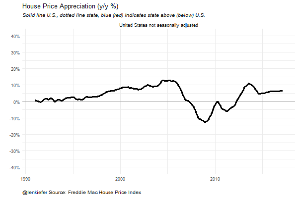
myplotf(myf("CA"))
Now let’s try a small multiple:
myplotf(filter(df.state,year(date)>1990  &
         !(geo %in%   c("United States not seasonally adjusted",
                           "United States seasonally adjusted","DC"))))
And add animation:
#### Create Animation ##############################################################################

mylist<-lapply(c("United States not seasonally adjusted",st.list,"United States not seasonally adjusted"),myf)


tween.df<-tween_states(mylist,tweenlength=1,statelength=2,
                       ease=rep('cubic-in-out',53), nframes=350)
tween.df<-data.table(tween.df)


oopt = ani.options(interval = 0.15)
saveGIF({for (i in 1:max(tween.df$.frame)) {
  g<-myplotf(filter(tween.df,.frame==i))
  print(g)
  print(i)
  ani.pause()
}
},movie.name="state ribbon hpa tween 05 18 2017.gif",ani.width = 600, ani.height =400)