SO WE HAVE BEEN PLOTTING A LOT OF INDEX VALUES LATELY. It’s been great. But you have questions. Great questions.
I got an interesting response to my house price dot chart over Twitter regarding the house price index we were plotting. User [@chrisschnabel](https://twitter.com/chrisschnabel) wondered how the choice of starting point influenced how the house price dot chart looked.
@lenkiefer This is a great viz, but conclusions will be drawn based on the date of the index. I'd love to see this side by side with 2017 as index=100
— Chris Schnabel (@chrisschnabel) May 23, 2017
The choice of index starting point does indeed influence how the index looks. Consider this visualization:
This visualization shows how the choice of starting point influences how the house price index (plotted on a log scale naturally) looks. Each line is an individual state’s house price index, normalized so that a particular date is equal to 100. The plots look quite different depending on the choice of normalizing date.
Let’s build up to this plot. Per usual I will include R code to construct the visualizations.
Get data
Like in some previous posts (check out here to see ribbon charts, here for dots charts and here for an interactive flexdashboard) we will use the Freddie Mac House Price Index.
While we shared the data wrangling bits before, it’s short enough that I can include them here.
You can download the Excel spreadsheet with state house price index values here. Note that this code is based on the release with data through March, 2017, future releases may shift the exact location of the cells. Using the range argument of readxl we can reach into the spreadsheet and get our data ready.
Just save the excel file in your own data directory.
Then:
###############################################################################
#### Load libraries
###############################################################################
library(readxl,quietly=T,warn.conflicts=F)
library(purrr,quietly=T,warn.conflicts=F)
library(ggplot2,quietly=T,warn.conflicts=F)
library(tidyr,quietly=T,warn.conflicts=F)
library(dplyr,quietly=T,warn.conflicts=F)
library(scales,quietly=T,warn.conflicts=F)    # for labels
library(animation,quietly=T,warn.conflicts=F)
library(lubridate,quietly=T,warn.conflicts=F)
###############################################################################
#### Read in HPI data
###############################################################################
df<-read_excel("data/states.xls",
               sheet = "State Indices",  # name of sheet
               range="B6:BB513" )        # range where data lives

###############################################################################
#### Set up dates from January 1975 to March 2017
###############################################################################
df$date<-seq.Date(as.Date("1975-01-01"),as.Date("2017-03-01"),by="1 month")
df.state<-df %>% gather(geo,hpi,-date) %>% mutate(type="state")
After completing this code you’ll have a data file ready for use. Let’s take a quick peek.
# use htmlTable library to make nicely formatted table, you can just use print
htmlTable::htmlTable(
  df.state %>% filter(date=="2017-03-01") %>% tail(10) %>%
    map_if(is.numeric,round,0) %>% as.data.frame(),
  col.rgroup = c("none", "#F7F7F7"),
  caption="Our data frame\ndf.state",
tfoot="Source: Freddie Mac House Price Index")| Our data frame df.state | ||||
| date | geo | hpi | type | |
|---|---|---|---|---|
| 1 | 2017-03-01 | TX | 184 | state |
| 2 | 2017-03-01 | UT | 176 | state |
| 3 | 2017-03-01 | VA | 182 | state |
| 4 | 2017-03-01 | VT | 168 | state |
| 5 | 2017-03-01 | WA | 204 | state |
| 6 | 2017-03-01 | WI | 134 | state |
| 7 | 2017-03-01 | WV | 145 | state |
| 8 | 2017-03-01 | WY | 187 | state |
| 9 | 2017-03-01 | United States not seasonally adjusted | 171 | state |
| 10 | 2017-03-01 | United States seasonally adjusted | 171 | state |
| Source: Freddie Mac House Price Index | ||||
For the moment all we need are the various state indices. The data come normalized so that December of 2000 is equal to 100. There’s nothing particularly special about that date. The index is most useful for calculating the percentage change in average house values between two points in time (see for example this FAQ). Because growth rates across states differ over time, the choice of the points you compare will influence how a the plot of an index will look.
To see how, let’s build up to our gif.
Let’s start by plotting just the index for one state, my current home of Virginia.
ggplot(data=filter(df.state,geo=="VA"),aes(x=date,y=hpi,label=round(hpi,0)))+
  geom_line()+
  theme_minimal()+
  theme(plot.caption=element_text(hjust=0))+
  scale_y_log10(limits=c(25,200),breaks=c(25,50,100,200,400))+
  geom_point(data=tail(filter(df.state,geo=="VA"),1),color="red",size=3,alpha=0.82)+
  geom_text(data=tail(filter(df.state,geo=="VA"),1),
            color="red",alpha=0.82,hjust=0, nudge_y=0.02)+
  labs(x="",y="",
       caption="@lenkiefer Source: Freddie Mac House Price Index through March 2017",
         subtitle="log scale, Dec 2000 = 100, NSA",
       title="Virginia house price trends")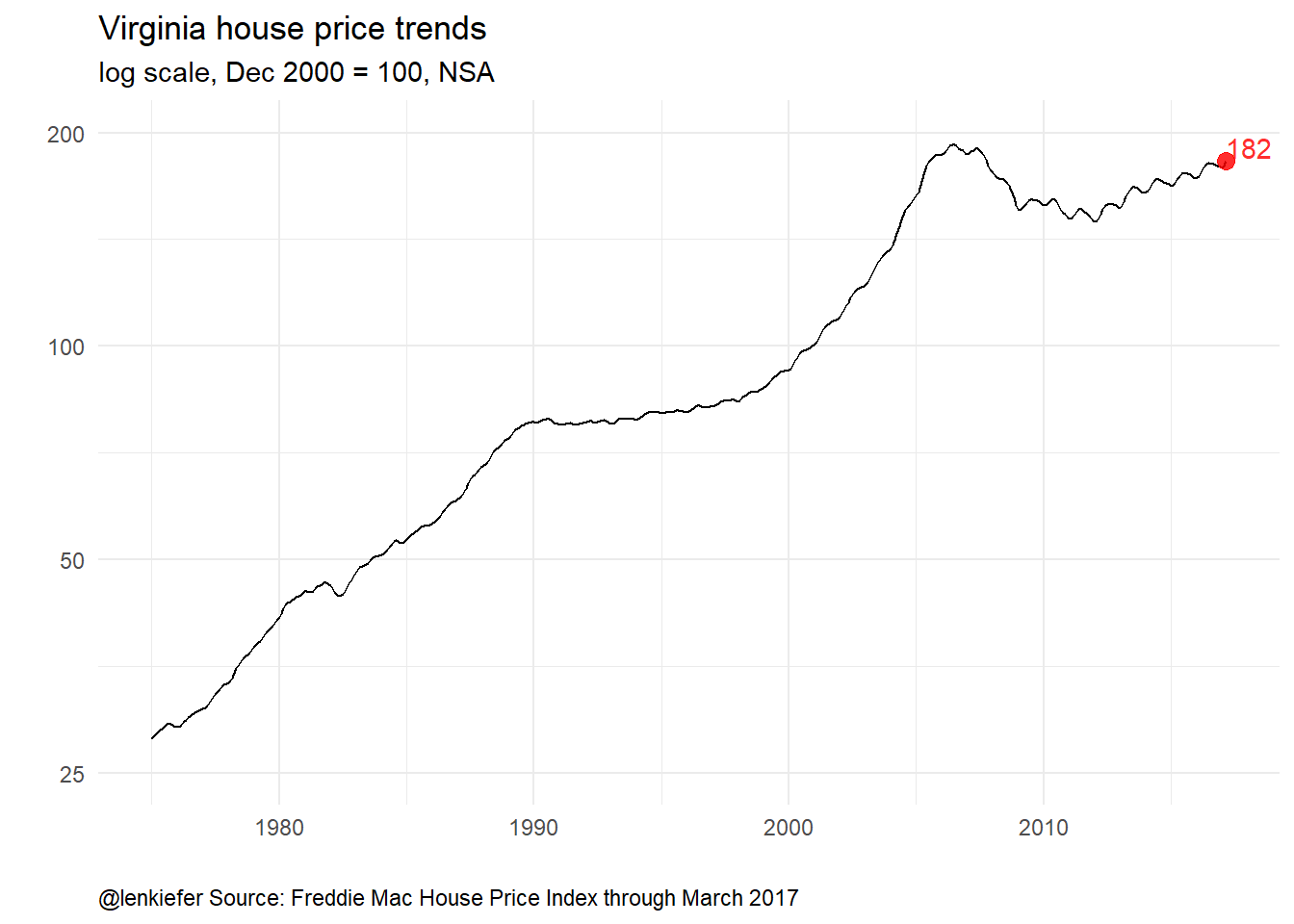
We’ve marked the last value (for March 2017) with a red dot and label. The Virginia index is at 181, which means that relative to December 2000, house prices in Virginia in March 2017 are up 81%.
If we were interested in how much prices have risen since March 2016, we could renormalize the index so that March 2016 is equal to 100 and replot the index. I’ve got a dplyr trick for this.
Using group_by and mutate plus brackets and a filtering statement such as mutate(hpi.0316=100*hpi/hpi[date=="2016-03-01"]) below enables us to index the time series data. Because I like to normalize data often, this little pattern is of great use to me.
# subset for just Virginia
df.va<-filter(df.state,geo=="VA")

###############################################################################
#### compute index normalized so March 2016 = 100
#### using hpi[ date== "2016-03-01"] filters the data to just March 2016
###############################################################################
df.va <- df.va %>% group_by(geo) %>%
  mutate( hpi.0316=100*hpi/hpi[date=="2016-03-01"]) %>% ungroup()

# plot it
ggplot(data=df.va,aes(x=date,y=hpi.0316,label=round(hpi.0316,1)))+
  geom_line()+
  theme_minimal()+
  theme(plot.caption=element_text(hjust=0))+
  scale_y_log10(limits=c(10,150),breaks=c(25,50,100,150))+
  geom_point(data=tail(df.va,1),color="red",size=3,alpha=0.82)+
  geom_text(data=tail(df.va,1),
            color="red",alpha=0.82,hjust=0.5, nudge_y=0.05)+
  labs(x="",y="",
       caption="@lenkiefer Source: Freddie Mac House Price Index through March 2017",
         subtitle="log scale, March 2016 = 100, NSA",
       title="Virginia house price trends")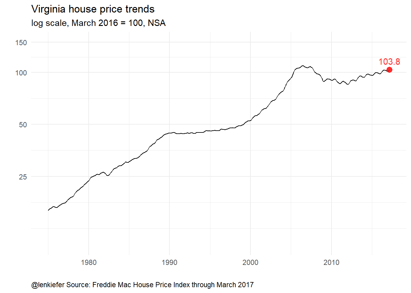
The general shape of the index looks the same (particularly on a log scale), but the index value is now 102.9, indicating that house prices in Virginia have risen 2.9 percent from March 2016 to March 2017.
Comparing many states
Let’s make some spaghetti. We’ll plot each of the 50 states plus the District of Columbia on a single plot. We’ll restrict our attention to just values from the year 2000 forward.
# filter out US index (both NSA and SA) {state are only NSA} and years before 2000
df<-filter(df.state,
           !(geo %in% c("United States not seasonally adjusted",
                        "United States seasonally adjusted" ) )
             & year(date)>1999)

ggplot(data=df,aes(x=date,y=hpi,group=geo))+
    geom_line(alpha=0.5)+
  theme_minimal()+
  theme(plot.caption=element_text(hjust=0))+
  scale_y_log10(limits=c(25,400),breaks=c(25,50,100,200,400))+
  labs(x="",y="",
       caption="@lenkiefer Source: Freddie Mac House Price Index through March 2017",
         subtitle="each line a state, log scale, Dec 2000 = 100, NSA",
       title="House price trends")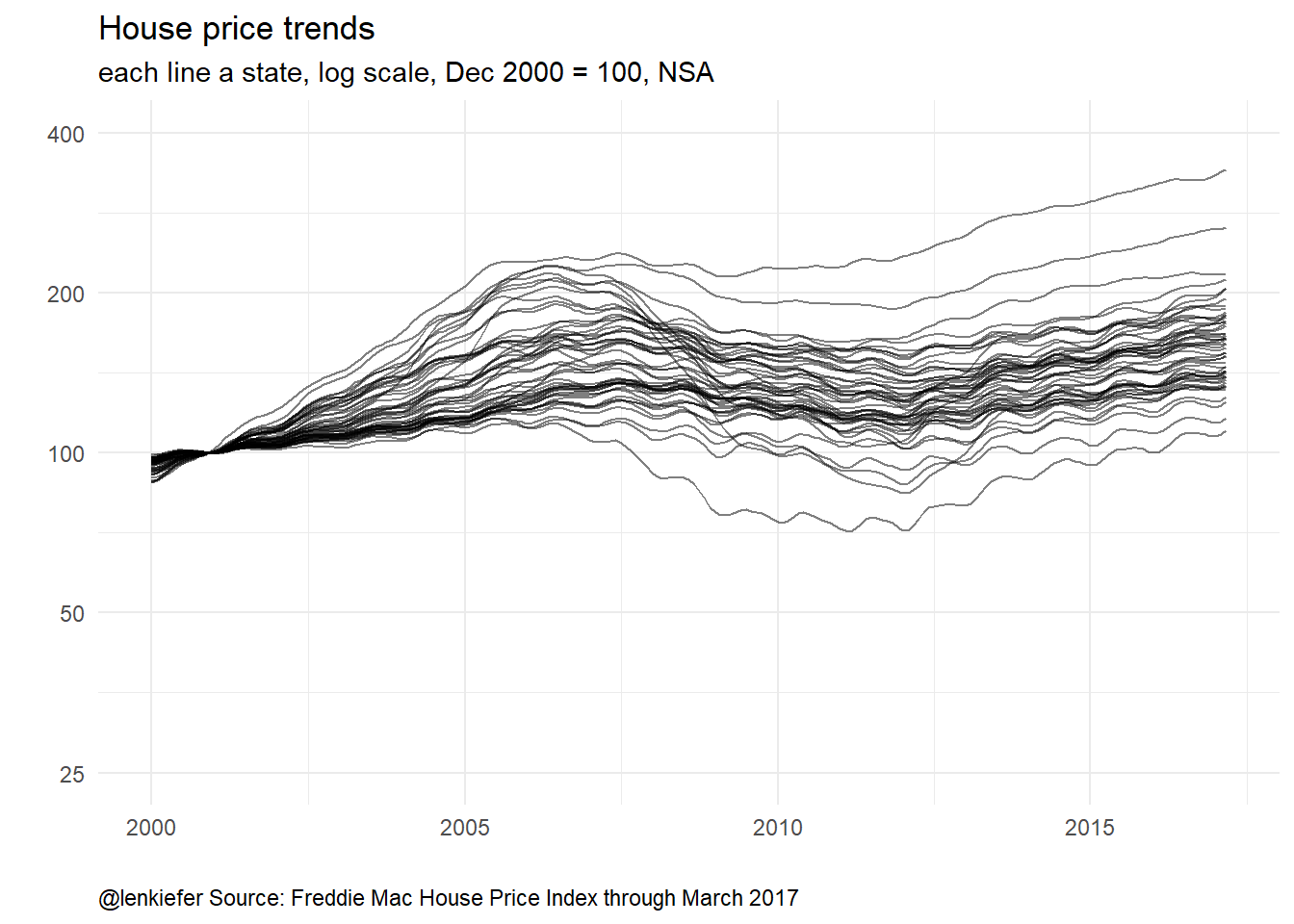
Now we can see quite a lot of variation across states.
Let’s renormalize so that our last data point (March 2017) is equal to 100 and plot it:
# compute index normalized so March 2016 = 100
df <- df %>% group_by(geo) %>%
  mutate( hpi2=100*hpi/hpi[date=="2017-03-01"]) %>% ungroup()

ggplot(data=df,aes(x=date,y=hpi2,group=geo))+
    geom_line(alpha=0.5)+
  theme_minimal()+
  theme(plot.caption=element_text(hjust=0))+
  scale_y_log10(limits=c(25,400),breaks=c(25,50,100,200,400))+
  labs(x="",y="",
       caption="@lenkiefer Source: Freddie Mac House Price Index through March 2017",
         subtitle="each line a state, log scale, March 2017 = 100, NSA",
       title="House price trends")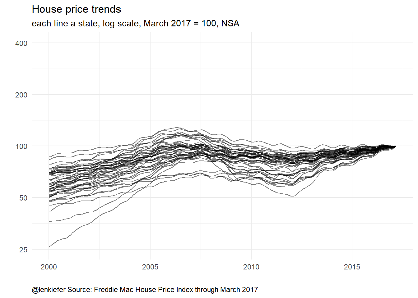
Same data, but doesn’t quite look the same.
Before we get to the animation, how about one more static plot?
Let’s make a small multiple seeing how the plots differ as we let the reference date vary from March of 2000 to March of 2017, one year at a time. We’ll also use purrr’s map_df to help us. For more see this post on nested recursions.
###############################################################################
#### Create a function for re-indexing data
###############################################################################
myf<-function(dd,s="VA"){
  df.out<-df %>% filter(geo==s) %>% group_by(geo) %>%
    mutate(hpi2=100*hpi/hpi[date==dd]) %>%
    ungroup()
  return(df.out)}

###############################################################################
#### Get list of dates
###############################################################################
dlist<-seq.Date(as.Date("2000-03-01"),as.Date("2017-03-01"), by= "1 year")

###############################################################################
#### create data frame for storing results
###############################################################################
df3<- data.frame(dd=dlist)

###############################################################################
#### use map2 & mutate to store re-normalized data
###############################################################################
df3<- df3 %>%

  # store data frames (output of function myf) as columns
  mutate(dindex=purrr::map2(dd,"VA",myf)) %>%

  # unnest the data frames
  unnest(dindex)

###############################################################################
#### create plot
###############################################################################
ggplot(data=df3, aes(x=date,y=hpi2))+
  geom_line()+
  facet_wrap(~dd)+
      geom_line(alpha=0.5)+
  geom_hline(yintercept=100,linetype=2)+
  geom_vline(aes(xintercept=as.numeric(dd)),linetype=2)+
  theme_minimal()+
  theme(plot.caption=element_text(hjust=0))+
  scale_y_log10(limits=c(25,250),breaks=c(25,50,100,200,400))+
  labs(x="",y="",
       caption="@lenkiefer Source: Freddie Mac House Price Index through March 2017",
         subtitle="Each panel with a different date normalized =100, NSA",
       title="Virginia house price trends")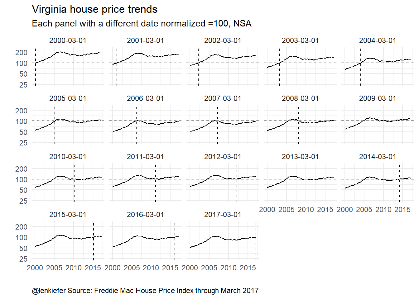
Here we can see that although renormalizing the index affects the level of the index, it doesn’t really change the shape. Especially if we plot the index on a log scale.
Make an animation
Now, we can use animation and the functions we’ve created to generate the animation we opened with.
###############################################################################
#### New function that returns all states
###############################################################################
myf2<-function(dd){
df.out<-df %>% group_by(geo) %>%
mutate(hpi2=100*hpi/hpi[date==dd]) %>%
ungroup()
return(df.out)}
###############################################################################
#### Get a list of dates (dlist) and length (N) of that list
###############################################################################
dlist<-unique(df$date)
N<-length(dlist)
###############################################################################
#### Create animation
###############################################################################
oopt = ani.options(interval = 0.1)
# We'll loop from 1:N and N:1 to go forward and back
saveGIF({for (i in c(1:N,N:1)) {
g<-
ggplot(data=myf2(dlist[i]),aes(x=date,y=hpi2,group=geo))+
geom_line(alpha=0.5)+
theme_minimal()+
geom_hline(yintercept=100,linetype=2)+
# We need to code the axes so that our axis scale stays fixed
# it's disorienting if we let the axis move
scale_y_log10(limits=c(25,400),breaks=c(50,100,200,400))+
geom_vline(xintercept=as.numeric(dlist[i]),linetype=2)+
geom_point(data=filter(myf2(dlist[i]),
date==dlist[i]),
size=2,color="red",alpha=0.8)+
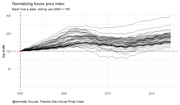
labs(title="Normalizing house price index",
x="",y="log scale",
subtitle=paste("Each line a state, letting",
as.character(dlist[i],format="%b-%Y"),"= 100"),
caption="@lenkiefer Source: Freddie Mac House Price Index")+
theme(plot.caption=element_text(hjust=0))
print(g)
print(paste(i,"out of",N)) #counter because I'm impatient
ani.pause()
}
for (i2 in 1:2) {
print(g)
ani.pause()
}
},movie.name="hpi time log index 05 23 2017.gif",ani.width = 600, ani.height = 350)Running this gives our original animated plot:
It kind of looks like you’ve got a wire-tie and a bunch of cords and you’re sliding the knot.
Conclusion
Whenever you look at index values, ratios, or any type of number that doesn’t have any units you should use a skeptical eye. Usually folks do not intend any evil, but careless use of such metrics can lead to spurious conclusions.
I like to look at data in a variety of ways. As I said earlier today, if a different visualizations of the same data tell different stories, then you might have found a compelling and completely false narrative. It happens, but active vigorous visualization can help decrease its likelihood.
Updated 2020-12-29 to restore images