IT IS TIME FOR AN UPDATE ON HOUSE PRICE TRENDS AROUND THE UNITED STATES.
I have been experimenting with some new visualizations and updating some old favorites. Let’s collect them here.
This post will be an extension of my Visual Meditations on House Prices series from last year. Check out those posts for additional visualizations.
Data
We’ll use the recently updated Freddie Mac House Price Index (link to source) data and use R to create some plots.
You can download spreadsheets containing (.xls links) U.S. national and state and metro area trends. Let’s presume you’ve saved those data in a folder, I call mine data.
We’ll use readxl to wrangle some data in Excel spreadsheets. See this post for more examples using readxl with global house price data.
Also, a little later we will be combining our house price data with unemployment data from the U.S. Bureau of Labor Statistics. In order to merge our data, we’ll need a simple crosswalk file (.txt) file:
Let’s load the state and national data and plot recent trends.
#####################################################################################
## Load Libraries ##
#####################################################################################
library(data.table)
library(quantmod)
## Loading required package: xts## Loading required package: zoo##
## Attaching package: 'zoo'## The following objects are masked from 'package:base':
##
## as.Date, as.Date.numeric##
## Attaching package: 'xts'## The following objects are masked from 'package:data.table':
##
## first, last## Loading required package: TTR## Version 0.4-0 included new data defaults. See ?getSymbols.library(tidyverse)## Loading tidyverse: ggplot2
## Loading tidyverse: tibble
## Loading tidyverse: tidyr
## Loading tidyverse: readr
## Loading tidyverse: purrr
## Loading tidyverse: dplyr## Conflicts with tidy packages ----------------------------------------------## between(): dplyr, data.table
## filter(): dplyr, stats
## first(): dplyr, xts, data.table
## lag(): dplyr, stats
## last(): dplyr, xts, data.table
## transpose(): purrr, data.tablelibrary(viridis)## Loading required package: viridisLitelibrary(readxl)
library(cowplot)##
## Attaching package: 'cowplot'## The following object is masked from 'package:ggplot2':
##
## ggsavelibrary(ggbeeswarm)
library(scales)##
## Attaching package: 'scales'## The following object is masked from 'package:purrr':
##
## discard## The following object is masked from 'package:readr':
##
## col_factorlibrary(ggjoy)
library(forcats)
library(kandinsky)
library(geofacet)
#####################################################################################
## Load data ##
#####################################################################################
df<-read_excel("data/states.xls",
sheet = "State Indices",
range="B6:BB516" )
df$date<-seq.Date(as.Date("1975-01-01"),as.Date("2017-06-01"),by="1 month")
#####################################################################################
## Manipulate data data ##
#####################################################################################
df.state<-df %>% gather(geo,hpi,-date) %>% mutate(type="state",state=geo) %>%
group_by(geo) %>%
mutate(hpa=hpi/shift(hpi,12)-1,
hpa1=hpi/shift(hpi,1)-1,
hpilag12=shift(hpi,12,fill=NA),
hpimax12=rollmax(hpi,13,align="right",fill=NA),
hpimin12=-rollmax(-hpi,13,align="right",fill=NA)) %>% ungroup() %>%
group_by(date) %>%
mutate(us.hpa=hpa[geo=="United States not seasonally adjusted"],
us.hpi=hpi[geo=="United States not seasonally adjusted"]) %>%
ungroup() %>% mutate(up=ifelse(hpa>us.hpa,hpa,us.hpa),
down=ifelse(hpa<=us.hpa,hpa,us.hpa),
dlabel=paste(as.character(date,format="%B-%Y")," \n ")) %>%
ungroup() %>%
filter( !( state %in% c("United States not seasonally adjusted",
"United States seasonally adjusted"))) %>%
group_by(state) %>% mutate(id = row_number()) %>% ungroup()
#####################################################################################
## Create U.S. only data ##
#####################################################################################
df.us<-df %>% select("United States seasonally adjusted",date) %>%
gather(geo,hpi,-date) %>% mutate(type="US",state=geo) %>%
mutate(hpa=hpi/shift(hpi,12)-1, hpa1=hpi/shift(hpi,1)-1)
#####################################################################################
## Plot U.S. trends ##
#####################################################################################
plot.hpi<-
ggplot(data=filter(df.us,year(date)>1999), aes(x=date,y=hpi,label=round(hpi,0)))+
geom_line()+theme_minimal()+
labs(x="", y="",
title="U.S. house price index",
subtitle="House price index: Dec 2000 = 100, seasonally adjusted",
caption="@lenkiefer Source: Freddie Mac House Price Index")+
theme(plot.title=element_text(size=14,face="bold"),
plot.subtitle=element_text(size=10,face="italic"),
plot.caption=element_text(hjust=0,size=8),
axis.ticks.length=unit(0.25,"cm")) +
geom_point(data=tail(df.us,1),color="red",size=3,alpha=0.82)+
geom_hline(yintercept=tail(df.us,1)$hpi,color="red",linetype=2)
plot.hpa<-
ggplot(data=filter(df.us,year(date)>1999), aes(x=date,y=hpa,label=round(hpa,0)))+
geom_line()+theme_minimal()+
scale_y_continuous(labels=percent)+
labs(x="", y="",
title="12-month percent change",
subtitle="U.S. House price index",
caption="")+
theme(plot.title=element_text(size=14,face="bold"),
plot.subtitle=element_text(size=10,face="italic"),
plot.caption=element_text(hjust=0,size=8),
axis.ticks.length=unit(0.25,"cm")) +
geom_point(data=tail(df.us,1),color="red",size=3,alpha=0.82)+
geom_hline(yintercept=tail(df.us,1)$hpa,color="red",linetype=2)+
geom_hline(yintercept=0,color="black",linetype=2)
plot_grid(plot.hpi, plot.hpa)
Note that I used the cowplot library to arrange multiple plots.
From this chart we can see that house prices are above their pre-recession peak and that the rate of growth is approaching seven percent on an annual basis. How do trends look at the state level? And how do they compare to the U.S. trend we plotted?
First, let’s look at state house price appreciation. We’ll create two small multiples, first a rectangular grid of state appreciation. Then we’ll use geo_facet for different layout. We’ll also use the ggjoy package for some sweet gradient shading.
df.state$statef<-fct_reorder(as.factor(df.state$state),
                              df.state$hpa,fun=last,.desc = T)

ggplot(data=filter(df.state,state !="DC" & year(date)>1999),
         aes(x=date,y=hpa,label=round(hpa,0)))+
  geom_line()+theme_minimal()+
    geom_ridgeline_gradient(aes(fill=hpa,y=0,height=hpa),min_height=-10)+
    scale_fill_viridis(option="C")   +
    facet_wrap(~statef,ncol=5)  +
  scale_y_continuous(labels=percent)+
  labs(x="", y="",
       title="12-month percent change in house prices",
       subtitle="House price index: Dec 2000 = 100, seasonally adjusted",
       caption="@lenkiefer Source: Freddie Mac House Price Index through June 2017")+
  theme(plot.title=element_text(size=14,face="bold"),
                legend.position="none",
        plot.subtitle=element_text(size=10,face="italic"),
        plot.caption=element_text(hjust=0,size=8),
        axis.ticks.length=unit(0.25,"cm")) +
    geom_hline(yintercept=0,color="black",linetype=2)
Now let’s try a geo facet layout:
ggplot(data=filter(df.state, year(date)>1999),
         aes(x=date,y=hpa,label=round(hpa,0)))+
  geom_line()+theme_minimal()+
    geom_ridgeline_gradient(aes(fill=hpa,y=0,height=hpa),min_height=-10)+
    scale_fill_viridis(option="C")   +
  scale_y_continuous(labels=percent)+
  scale_x_date(date_labels="%y",date_breaks="5 years")+
  labs(x="", y="",
       title="House price appreciation by state: Jan 2000 - Jun 2017",
       subtitle="12-month percent change in house price index",
       caption="@lenkiefer Source: Freddie Mac House Price Index through June 2017")+
  theme(plot.title=element_text(size=14,face="bold"),
        legend.position="none",
        plot.subtitle=element_text(size=10,face="italic"),
        plot.caption=element_text(hjust=0,size=8),
        axis.ticks.length=unit(0.25,"cm")) +
    geom_hline(yintercept=0,color="black",linetype=2)+
    facet_geo(~ state, grid = "us_state_grid2")
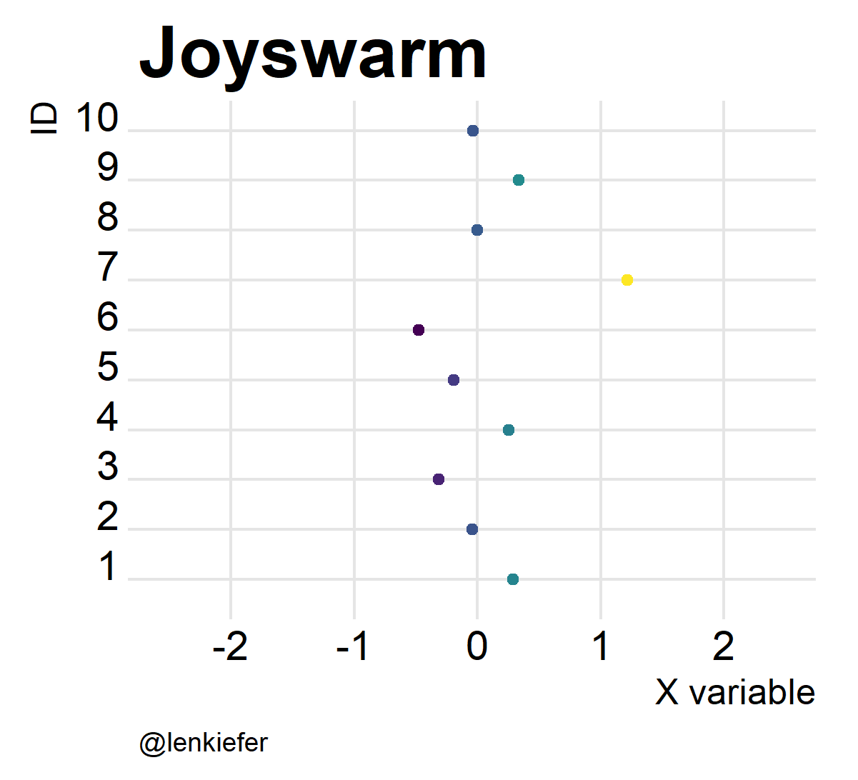
Joyswarm
Let’s now turn to metro area data and make a joyswarm plot (see the post for more on joyswarm plots). We can get monthly house price indices for over 300 metro areas. They are stored in two separate worksheets in the metro spreadsheet. Let’s load the data, compute 12-month appreciation rates by metro area and plot a joyswarm plot.
###############################################################################
#### Load metro data
###############################################################################
df2<-read_excel("data/msas_new.xls",
                sheet = "MSA Indices A-L",
               range="B6:HG516" )
df2$date<-seq.Date(as.Date("1975-01-01"),as.Date("2017-06-01"),by="1 month")

df3<-read_excel("data/msas_new.xls",
                sheet = "MSA Indices M-Z",
                range="B6:FM516" )
df3$date<-seq.Date(as.Date("1975-01-01"),as.Date("2017-06-01"),by="1 month")

###############################################################################
#### merge data and compute 12-month % change
###############################################################################

df4<-left_join(df2,df3,by="date")
df.metro <- df4 %>% gather(geo,hpi,-date) %>% mutate(type="metro")
df.metro
## # A tibble: 194,820 x 4
## date geo hpi type
## <date> <chr> <dbl> <chr>
## 1 1975-01-01 Abilene, TX 44.61498 metro
## 2 1975-02-01 Abilene, TX 45.06790 metro
## 3 1975-03-01 Abilene, TX 45.86827 metro
## 4 1975-04-01 Abilene, TX 47.03022 metro
## 5 1975-05-01 Abilene, TX 47.38393 metro
## 6 1975-06-01 Abilene, TX 46.81175 metro
## 7 1975-07-01 Abilene, TX 46.41641 metro
## 8 1975-08-01 Abilene, TX 46.35436 metro
## 9 1975-09-01 Abilene, TX 46.44499 metro
## 10 1975-10-01 Abilene, TX 46.57779 metro
## # ... with 194,810 more rowsdf.metro <- df.metro %>% mutate(state=substr(geo,nchar(geo)-1,nchar(geo)))
df.metro<-df.metro %>% group_by(geo) %>%
mutate(hpa=hpi/lag(hpi,12)-1) %>% ungroup()
###############################################################################
#### create joyswarm
###############################################################################
ggplot(data=filter(df.metro,year(date)>2003 & month(date)==6), aes(x=hpa,y=forcats::fct_reorder(factor(year(date)),date,.desc=T),color=hpa,fill=hpa))+
geom_joy(alpha=0.25,rel_min_height=0.005)+
geom_quasirandom(alpha=0.8,size=0.2)+
scale_fill_viridis(option="C")+
scale_color_viridis(option="C")+
theme_minimal()+
theme(legend.position="none",
plot.caption=element_text(hjust=0))+
scale_x_continuous(labels=percent)+
labs(x="12-month percent change in house price",y="",
title="Distribution of metro area house price appreciation",
subtitle="12-month percent change in June of each year",
caption="@lenkiefer Source: Freddie Mac House Price Index. Each dot a metro area, curve density over metros.")## Picking joint bandwidth of 0.0112
This plot shows the distribution of house price increases has shifted higher over the past couple of years, but remains below the 2013 levels (when housing markets were recovering from the Great Recession) and the levels of last decade.
Relating house price trends to economic variables
We can relate house price trends to other economic variables. Let’s go back to the state data and plot the relationship between state house price appreciation and the unemployment rate. We’ll go get unemployment data from the U.S. Bureau of Labor Statistics.
# Download data big file
ur.data<-fread("https://download.bls.gov/pub/time.series/la/la.data.1.CurrentS")

# Download series ids

ur.series<-fread("https://download.bls.gov/pub/time.series/la/la.series")

# We'll subset data
ur.list<-ur.series[area_type_code =="A" &   #get states
                     measure_code == "3"  &   #get unemployment rate
                     seasonal == "S",         #get seasonally adjusted data
                   c("series_id","area_code","series_title"),
                   with=F]

## Get state names and area crosswalk
ur.area<-fread("https://download.bls.gov/pub/time.series/la/la.area",
               col.names=
                 c("area_type_code","area_code","area_text","display_level",
                   "selectable","sort_sequence","blank"))
## Warning in fread("https://download.bls.gov/pub/time.series/la/la.area", :
## Starting data input on line 2 and discarding line 1 because it has too
## few or too many items to be column names or data: area_type_code area_code
## area_text display_level selectable sort_sequence# merge data
ur.dt<-merge(ur.data,ur.list,by="series_id",all.y=T)
#create data variable
ur.dt[,month:=as.numeric(substr(ur.dt$period,2,3))]
ur.dt$date<- as.Date(ISOdate(ur.dt$year,ur.dt$month,1) ) #set up date variable
ur.dt<-merge(ur.dt,ur.area[,c("area_text","area_code"),with=F],by="area_code")
# Load national unemployment rate using quantmod and FRED database
# helpful reference https://jeffreybreen.wordpress.com/tag/quantmod/
unrate = getSymbols('UNRATE',src='FRED', auto.assign=F) ## 'getSymbols' currently uses auto.assign=TRUE by default, but will
## use auto.assign=FALSE in 0.5-0. You will still be able to use
## 'loadSymbols' to automatically load data. getOption("getSymbols.env")
## and getOption("getSymbols.auto.assign") will still be checked for
## alternate defaults.
##
## This message is shown once per session and may be disabled by setting
## options("getSymbols.warning4.0"=FALSE). See ?getSymbols for details.unrate.df = data.frame(date=time(unrate), coredata(unrate) )
# Drop some columns
ur.dt2<-ur.dt[,c("date","area_text","value"),with=F]
## rename variables
ur.dt2<-dplyr::rename(ur.dt2, state=area_text)
ur.dt2<-dplyr::rename(ur.dt2, ur=value)
# merge national unemploymnent
ur.dt2<-merge(ur.dt2,unrate.df,by="date")
ur.dt2<-dplyr::rename(ur.dt2, ur.us=UNRATE) #rename UNRATE to ur.us
# create variables for use in ribbon chart
ur.dt2[,up:=ifelse(ur>ur.us,ur,ur.us)]## Warning in `[.data.table`(ur.dt2, , `:=`(up, ifelse(ur > ur.us, ur,
## ur.us))): Invalid .internal.selfref detected and fixed by taking a
## (shallow) copy of the data.table so that := can add this new column by
## reference. At an earlier point, this data.table has been copied by R (or
## been created manually using structure() or similar). Avoid key<-, names<-
## and attr<- which in R currently (and oddly) may copy the whole data.table.
## Use set* syntax instead to avoid copying: ?set, ?setnames and ?setattr.
## Also, in R<=v3.0.2, list(DT1,DT2) copied the entire DT1 and DT2 (R's list()
## used to copy named objects); please upgrade to R>v3.0.2 if that is biting.
## If this message doesn't help, please report to datatable-help so the root
## cause can be fixed.ur.dt2[,down:=ifelse(ur<ur.us,ur,ur.us)]
# drop D.C. and Puerto Rico (so we can have 50 plots in small multiple)
ur.plot<-ur.dt2[! state %in% c("Puerto Rico","District of Columbia")]
ur.plot<-ur.dt2[! state %in% c("Puerto Rico")]
# Get list of states:
st.list<-unique(ur.plot$state)
#Add U.S. as it's own state (for use in animation)
ur.plot.us<-copy(ur.plot)[state=="Alabama"]
ur.plot.us[,state:="United States"]
ur.plot.us[,ur:=ur.us]
ur.plot.us[,up:=ur.us]
ur.plot.us[,down:=ur.us]
ur.plot2<-rbind(ur.plot,ur.plot.us)Now with these data in hand, we can recreate the plot I described here, but with a geofacet layout.
    ggplot(data=ur.plot2,aes(x=date,y=ur))+
    geom_line(color="black")+
    geom_line(linetype=2,aes(y=ur.us))+
    geom_ribbon(aes(ymin=ur,ymax=down),fill="#d73027",alpha=0.5)+
    geom_ribbon(aes(ymin=ur,ymax=up),fill="#4575b4",alpha=0.5)+
    facet_wrap(~state,ncol=10,scales="free_x")+
    scale_y_continuous(limits=c(0,20))+
    theme_minimal()+
    theme(legend.position="top",
          plot.caption=element_text(hjust=0),
          plot.subtitle=element_text(face="italic"),
          plot.title=element_text(size=16,face="bold"))+
    labs(x="",y="",
         title="The state of U.S. jobs - Working out @hrbmstr's workout of @stiles' Viz",
         subtitle="Solid line is state unemployment rate, dotted line is U.S. average unemployment rate\nRed (blue) indicates the state level is higher (lower) than the national average",
         caption="@lenkiefer Data Source: U.S. Bureau of Labor Statistics\nViz based on https://rud.is/b/2017/01/18/workout-wednesday-redux-2017-week-3/,\nitself based on http://thedailyviz.com/2016/12/14/four-decades-of-state-unemployment-rates-in-small-multiples-part-2/")+
    geom_rug(aes(color=ifelse(ur>ur.us,"Worse","Same or Better")),sides="b")+
    scale_color_manual(values=c("#4575b4","#d73027"),name="Better or worse than U.S.")+
    scale_x_date(date_labels="%y",date_breaks="10 years")+
    facet_geo(~ state, grid = "us_state_grid2")
## Some values in the specified facet_geo column 'state' do not match
## the 'name' column of the specified grid and will be removed:
## United States
Ha ha! That’s a lot of fun. Now let’s combine the house price data with the unemployment data.
House price and unemployment
#####################################################################################
# add region crosswalk
#####################################################################################

region<-fread("data/region.txt")


#####################################################################################
# merge up data
#####################################################################################
ur.plot3<-merge(ur.plot2,select(region,statecode,statename),
                by.x="state",by.y="statename") %>%
  rename(statename=state)

dfhu<-merge(df.state,select(ur.plot3,-up,-down),
            by.x=c("geo","date"),by.y=c("statecode","date"))


ggplot(data=filter(dfhu,date==max(dfhu$date)),
       aes(x=ur,y=hpa,group=state,label=state))+
  geom_text(size=3,alpha=0.82)+
  theme_minimal()+
  scale_x_continuous()+
  scale_y_continuous(labels=percent)+
  scale_colour_gradient(low="red",high="blue",
                               name = "12-month percent change",
                               labels = percent  )+
  labs(y="12-month percent change in house prices",
       x="Unemployment rate (percent)",
       title="House prices and unemployment",
       subtitle="June, 2017",
       caption="@lenkiefer Source: Freddie Mac house price index, U.S. Bureau of Labor Statistics")+
    theme(plot.title=element_text(size=18),
          plot.caption=element_text(size=7,hjust=0,vjust=1),
          legend.key.width=unit(1,"cm"),
          legend.position="top",
          panel.grid.major.y =element_blank())
This plot shows that in general, states with relatively higher unemployment rates tend to have lower house price growth.
Let’s see how the relationship evolves over time. We’ll trace out a pather using geom_path, first for just the state of California.
#####################################################################################
# make list of dates
#####################################################################################
dlist<-unique(filter(dfhu,year(date)>1999)$date)

#####################################################################################
# generate some functions (the utility will become apparent soon)
#####################################################################################

myf5<- function (s, slist="CA") { return(filter(dfhu,
                                                date>as.Date("2000-11-01") &
                                                  date<=s & state %in% slist) )}

myplot5<-function(df3) {
  g<-
    ggplot(data=df3,
           aes(x=ur,y=hpa,group=state,color=hpa1,label=state))+
    geom_point(data=filter(df3,date==max(df3$date)),size=2)+
    geom_path(aes(alpha=id))+
    guides(alpha=F,color=F)+
    theme_minimal()+
    geom_hline(yintercept=0,color="black",linetype=2)+
    geom_vline(xintercept=100,color="black",linetype=2)+
    scale_x_continuous(limits=c(0,15))+
    scale_y_continuous(labels=percent,limits=c(-.4,.4))+
    scale_colour_gradient(low="red",high="blue",name = "12-month percent change",
                          #limits=c(-.6,.6),
                          labels = percent  )+
    labs(y="12-month percent change in house prices",
         x="Unemployment rate (percent)",
         title="House prices and unemployment",
         subtitle="December 2000 through June 2017",
         caption="@lenkiefer Source: Freddie Mac house price index, U.S. Bureau of Labor Statistics")+
    theme(plot.title=element_text(size=18),
          plot.caption=element_text(size=7,hjust=0,vjust=1),
          legend.key.width=unit(1,"cm"),
          legend.position="top",
          panel.grid.major.y =element_blank())+facet_wrap(~state)
  return(g) }

myplot5(myf5(dlist[210],"CA"))
## Warning: Removed 1 rows containing missing values (geom_vline).
Now let’s try it for several states:
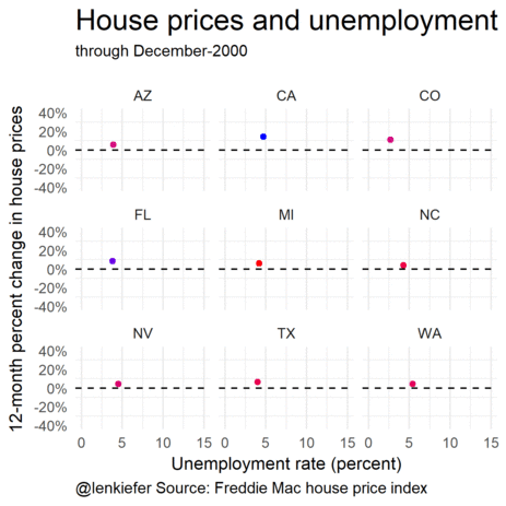
st.list<- c("CA","TX","FL","NV","AZ","WA","CO","MI","NC")
myplot5(myf5(dlist[210],st.list))
## Warning: Removed 9 rows containing missing values (geom_vline).
Now let’s try to show it for all states.
ggplot(data=filter(dfhu, date>as.Date("2000-11-01")),
       aes(x=ur,y=hpa,color=hpa1,label=state))+
  geom_path(aes(alpha=id))+

  guides(alpha=F,color=F)+
  theme_minimal()+
  geom_hline(yintercept=0,color="black",linetype=2)+
  geom_vline(xintercept=100,color="black",linetype=2)+
  scale_x_continuous(limits=c(0,15))+
  scale_y_continuous(labels=percent,limits=c(-.4,.4))+
  scale_colour_gradient(low="red",high="blue",name = "12-month percent change",
                        #limits=c(-.6,.6),
                        labels = percent  )+
  labs(y="12-month percent change in house prices",
       x="Unemployment rate (percent)",
       title="House prices and unemployment",
       subtitle="December 2000 through June 2017",
       caption="@lenkiefer Source: Freddie Mac house price index, U.S. Bureau of Labor Statistics")+
  theme(plot.title=element_text(size=18),
        plot.caption=element_text(size=7,hjust=0,vjust=1),
        legend.key.width=unit(1,"cm"),
        legend.position="top",
        panel.grid.major.y =element_blank())+  # use facet_geo
  facet_geo(~ state, grid = "us_state_grid2")
## Warning: Removed 96 rows containing missing values (geom_vline).
Some animations
We can animate the swirly plot above for several states:
C:.github.com_aug_7_2017 redblueswirl9.gif
We can also animate this chart we made last year, but with updated data through June 2017.
Kandinsky plots
Finally, let’s make some Kandisky style plots (see e.g. this post)
The US
kandinsky(filter(df.us,year(date)>1999) %>% select(date,hpi))
  grid.text(label=paste("U.S. house price index Jan 2000 - Jun 2017\n@lenkiefer, made using R package Kandinsky"),
            gp=gpar(fontsize=12),
            x=.95,y=0.075,just="right")
Virginia, Texas, Ohio, Kentucky
kandinsky(filter(df.state,
                   state %in% c("VA","TX","OH","KY")) %>% select(date,state,hpa))
  grid.text(label=paste("12-month percent change in house price index\nJan 1976 - Jun 2017\nVA, TX, OH, and KY\n@lenkiefer, made using R package Kandinsky"),
            gp=gpar(fontsize=12),
            x=.95,y=0.8,just="right")